Preview: A New Design for Reports
As an intern at Label305, I was tasked with redesigning Keeping's reports page. In this article, I'll discuss my design choices in detail and briefly introduce myself. The design is not yet final and has not been implemented, so what follows can be considered a preview.
My name is Nynke Zwart, and I am a sixth-year student. Over my years of study, I completed a Bachelor’s in Artificial Intelligence in Nijmegen and am now working on a Master’s in Interaction Technology in Enschede. I’ve always had a creative streak and wanted to dive deeper into app design and the psychology behind it. Through LinkedIn, I found Label305, and after reaching out to see if they might need an intern, I was invited for an interview and later accepted.
Working as a “User Experience Designer” on a new redesign for Keeping’s reports became my internship project. A comprehensive survey conducted by my colleague Zgjim showed that 60.7% of users who use the reporting feature (84 respondents) find it easy to very easy to understand.
60.7% of all report users find it easy to use. Improving this user experience became my task.
As a UX Designer, you start by mapping out your users and their habits and needs. Naturally, I had to familiarize myself with the app as a new user myself, which was actually beneficial since I saw the app with fresh eyes. Alongside my observations, I had a group of participants complete various tasks in Keeping. I asked them to think aloud and recorded their mouse movements for later analysis of their clicking behavior. The results gave me the following guidelines:
- Make date adjustments easier: this caused the most confusion.
- Improve overview: users often lose track because results are hidden behind tabs. Users also miss titles and navigation paths (breadcrumbs) because they’re placed outside the main framework.
- Enhance consistency: no more buttons changing position or meaning.
- Enable quick filtering.
- Provide different visualization options.
After defining these points, the design process began! Many ideas came up, especially in the initial phase. The primary focus at the start was improving the navigation structure, with pixel-perfect visuals coming later. Week by week, I presented new prototypes to my supervisors, Thijs and Xander, then went back to work with a list of feedback, and so the cycle continued.
What follows are the new design ideas for the reporting feature in Keeping. Comments or other ideas are very welcome in our inbox!
Easily Adjust Dates
In the current design, adjusting dates was found to be cumbersome. Different elements related to dates are far apart (the green arrows, the “View a” menu). This often led users to believe that the green left arrow would navigate to the previous page instead of moving back a time unit. Because of this, users tended to rely on the “Group by:” menu, or they started there right away since they ignored everything outside the large white box. However, the grouping menu is primarily intended for analyzing a chosen period, like configuring the number of hours worked per day (the grouping) in a week (the chosen period). While it is possible to get almost anywhere via the “Group by:” menu, it’s not optimal and feels cumbersome.
Psychological research has shown that people believe items that belong together are placed close to each other. This type of grouping reduces mental load, as people don’t have to gather related items themselves. We incorporated this knowledge into the redesign: the arrows are now closer to the centered date, eliminating ambiguity. Hovering over the date reveals a green underline that invites users to click. Upon clicking, a new menu opens where periods can be selected faster than before. At the top of the menu, the time unit can be selected (day, week, month, quarter, year, custom, and all). If you click on month, you’ll immediately see the twelve months of the year. With a few clicks, you can set any date you want.
Creating Overview
What’s behind the tabs for Projects, Team, Period, and more? Where am I in the app? What are the values I’m seeing for? Many users miss the titles above the tabs, leading to uncertainty in their navigation. To understand what they’re looking at, users must scan the entire page: a title here, a highlighted tab there, and another highlighted tab elsewhere.
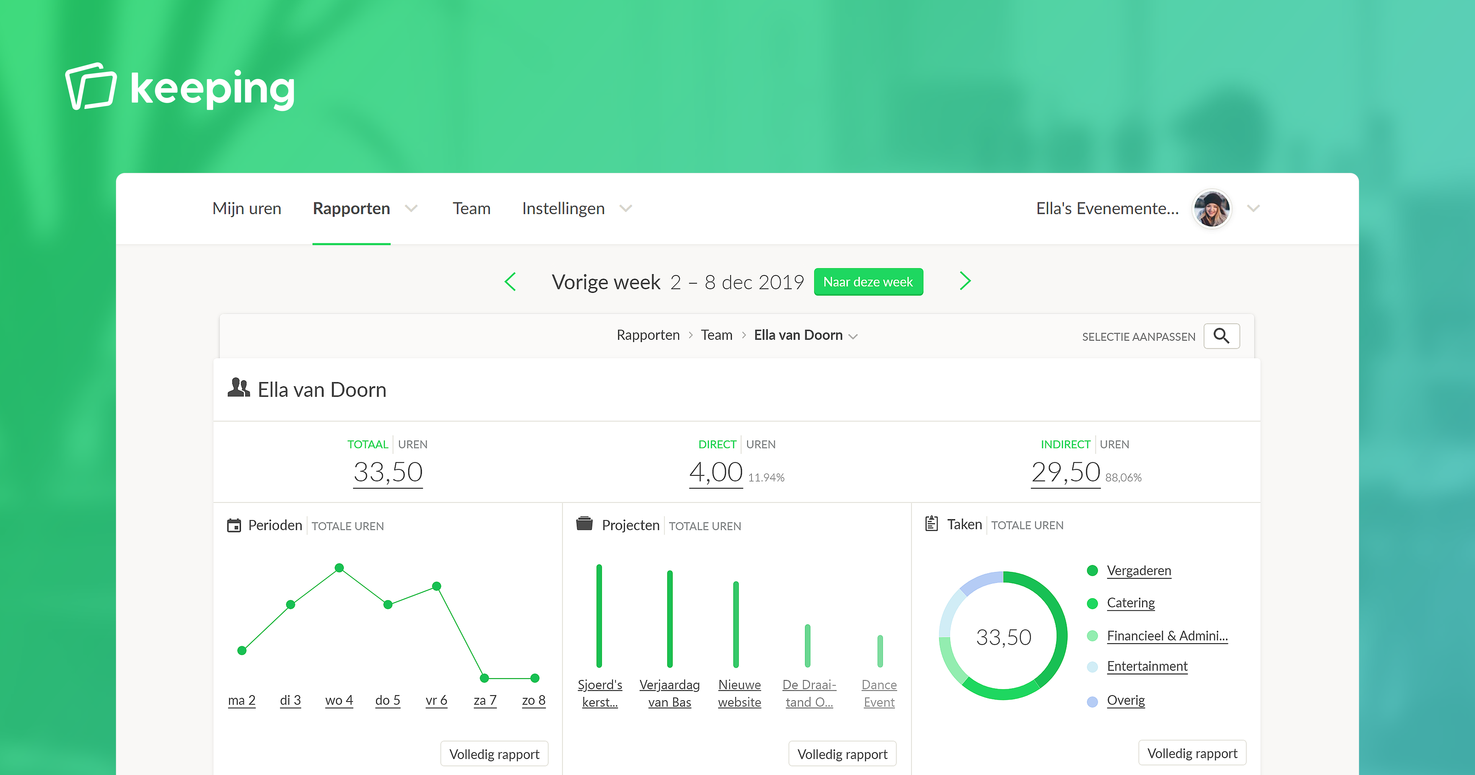
After many mock-ups, we came up with the idea of a dashboard. This dashboard provides a visual representation of the top five pieces of information for each category (box). Each box is also a preview of what the user can expect after clicking “Full report” in the box. Additionally, the subtitle of the entire page is placed within the large white box rather than outside it.
Quickly go from the dashboard to the detailed report you’re looking for: simply click on the box of your choice.
In the current version, irrelevant tabs disappear as users delve deeper into the app. In the dashboard, the boxes remain visible at all times and contain an informative null state when there is no further information available. This helps users understand why some options are no longer available. Additionally, the boxes never change position, promoting automated actions.
You may notice that some text elements are underlined. When a user clicks on such a text link, they’re applying a filter. If the user clicks on such a text element on the dashboard, the information on the dashboard adjusts to the element clicked.
If the user wants more information or the element they’re looking for is not in the top 5 box, they can click on “Full report.” This opens a page with all the information related to that box on the dashboard. This principle is called progressive disclosure: showing small bits of information relieves the brain of large amounts of data. More information only appears in a deeper layer when chosen. The clear distinction between these two types of pages is also intended to prevent change blindness—failing to notice changes in our visual field.
The detailed report page displays all the information associated with the selected box. On this page, users can apply filters, create different downloads, and navigate to deeper dashboards. If I click on the underlined “Meeting,” one of Ella's tasks, I’ll proceed to the specific “Meeting by Ella van Doorn” dashboard and see everything relevant to it. If I click on an underlined number of hours, I’ll go to the underlying time entries page, which we’ll discuss next.
Improving Consistency
The biggest inconsistency was the underlying time entries page. On this page, users can see all individual time entries that contribute to the totals on other report pages. However, this page didn’t match the rest: the meaning of the left arrow is now “previous page” instead of “previous time unit,” the “Group by:” menu is now where the “View a” menu is, and the totals and number of found entries are shown differently than on other report pages (in small circles instead of larger text). We addressed this, resulting in the example video above.
The Ability to Filter Quickly
In previous user tests, it became clear that users wanted a filter option. This would enable them to quickly select combinations of categories like Team and Tasks and also filter out certain elements. The invoicing page and underlying time entries page already have a filter bar, which we built upon. The following changes were made: you can now easily type/select multiple options in the filter bar without it closing, view options per category, and the selected filters are grouped by category in the filter bar itself. This improves overview. Clicking on the white space in the filter bar opens the filter in the “All” tab. Clicking on a specific label, like the