Try Keeping's Updated and Simplified Reports
Today, we're launching a new version of the reports. You can quickly set and switch calendar periods, find underlying time entries with ease, and enjoy simplified navigation. Additionally, the reports now include beautiful graphs, and you start on an organized dashboard. Of course, you don’t have to use the new reports yet; switching back to the old version is quick and easy.
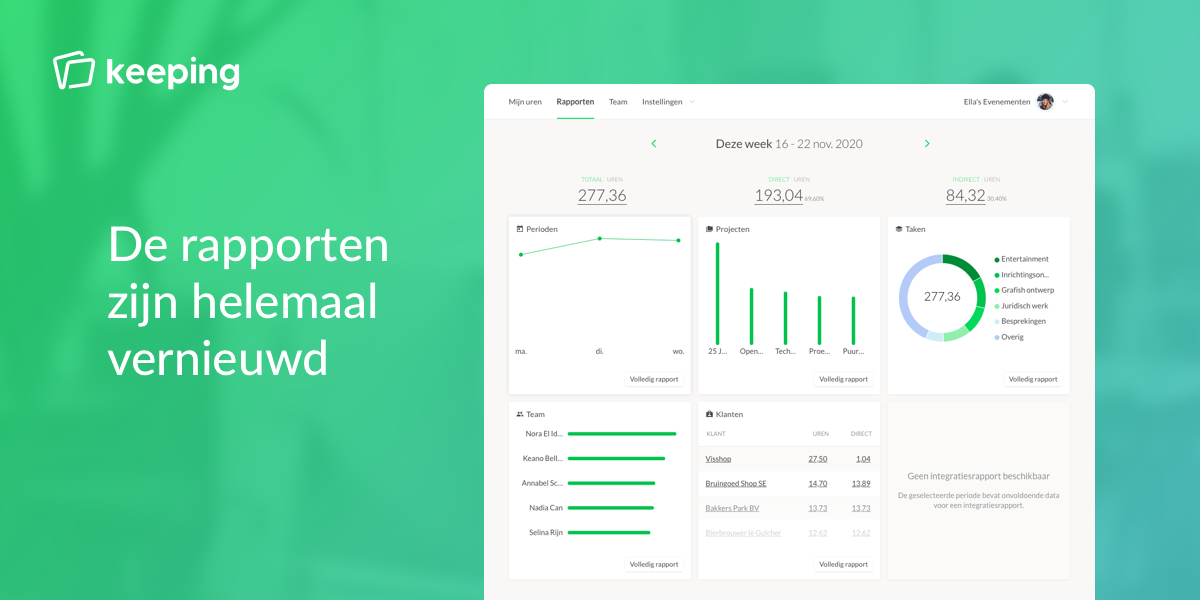
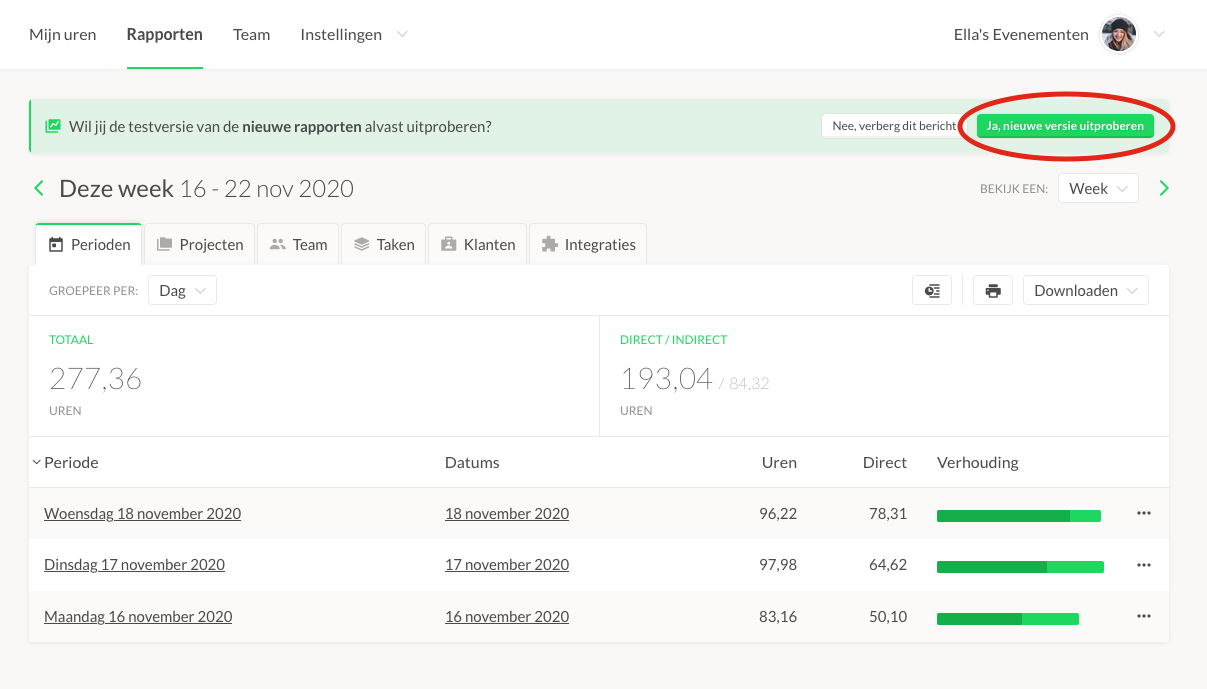
Last year, we gave you a peek into the design process of Keeping's new reports. We now have a version ready for all users to try. By default, you'll still see the familiar old reports, but we’ve added a button on the reports page that lets you switch to the new version.
Faster Navigation
When designing the new reports, we focused on making all navigation options even clearer. In the new reports, you start on a dashboard with six tiles. Each tile is a preview of the information you can find in the report. From these reports, you can click through to see an overview of a specific item (e.g., a project), just as you could in the old reports. The navigation path at the top shows exactly how you arrived at the current view. You can also quickly return to a previous view, something that wasn’t as easy in the old reports.
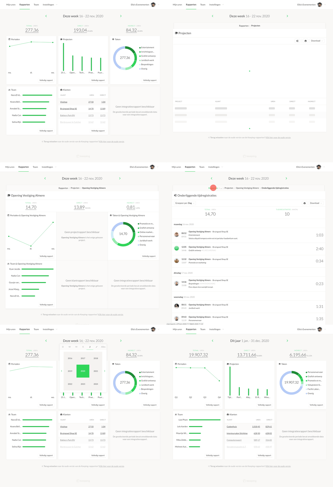
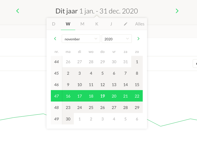
We've also simplified the process of selecting a date range with a date selection popover. Previously, you had to navigate back and forth or search for the correct dates in the period table. Now, you can quickly select the desired period on any page, even the page where you view underlying time entries.
Charts
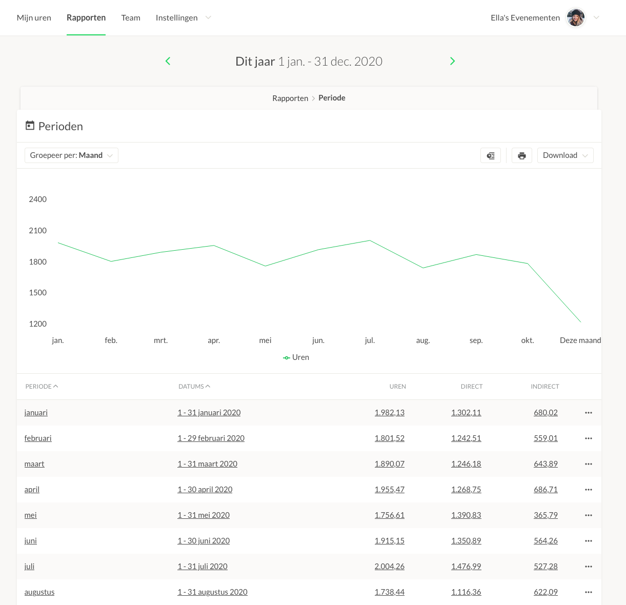
Each report now features a beautiful animated chart. You get a preview on the dashboard, and you can view a larger chart by clicking through. When you switch to the next period (e.g., week), the chart smoothly updates to correspond with the new data.
Numerous Improvements
And there are many other small improvements:
- You can now sort on all columns, and this sorting is preserved in PDF and Excel exports.
- The reports are fully optimized for small screens and mobile, just like the old reports.
- You can still see the revenue from your work in the reports by associating invoices with logged time.
- Keeping now handles large reports even better.
- Click through to underlying time entries by simply clicking on an hour total, even for direct and indirect hours.
This is the First Version
This is the first version we’re sharing with you. We have additional improvements in the pipeline that will be added to the new reports. Have feedback? Let us know via [email protected]!
Want to switch back to the old familiar version of the reports? There’s a link at the bottom where you can switch back.