What I was able to make in 10 weeks as an intern at Keeping
My name is Nathan. I am in my second year of Communication & Multimedia Design at HvA, specializing in Interaction Design and Behavioral Patterns. I belong to the category of students who enjoy designing, building, and thinking about business and user goals.
My internship period has ended; and what a ride it was!
I’ve been able to do, create, and learn a lot at Keeping. Ten weeks is a short time, so to make the most of it, I really put in the effort these past weeks.
Now that this period is wrapping up, we thought it would be a good idea for me to write a blog post about it. I’ve had ten intense weeks, and I’d love to share what I’ve been up to!
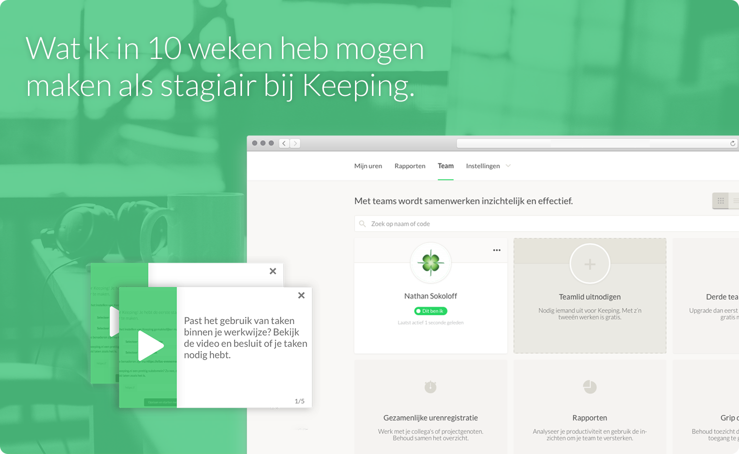 Image: During my internship, I got to work on multiple parts of the application.
With a portfolio of my favorite student projects and a good chat, I sat down with Label305 and learned about their time-tracking product, “Keeping.” This is what I would get to work on during my internship. Keeping is constantly innovating within the platform. For me as a developing designer, this is the perfect opportunity to gain practical experience and see how new features and innovations come about.
Keeping is built with Laravel, an accessible and stable PHP framework. To contribute to the application and implement interactions, I needed to understand parts of it. To quickly apply this, I used Laracasts, an online educational platform focused on the Laravel platform.
After studying the folder structure and the screens of the application, I created an overview of the user goals. This not only gave me insight into the types of users of the application, but it also served as a communication tool with the product owner. This way, I ensured we were on the same page and thinking in the same direction. A product owner is the primary stakeholder of a product, responsible for the product vision and, for example, prioritizing new features.
"After studying the folder structure and screens of the application, I created an overview of the user goals."
UX | Teams & Team Members
After consultation, we decided to enhance the team screen of the application with an informative zero-state—the state of a page before any action is taken. In the case of the team screen, this is when a user has not yet added team members to their Keeping environment. A zero-state can both guide users in using the application and highlight parts of the application, informing users about team functionalities in Keeping.
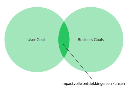
Image: User goals vs. business goals.
I started designing several concepts for the team overview in the application. It was to be a mix of informative and interactive elements that would clarify the use of Team Members. To account for different types of users, a dynamic layout was needed, one that adjusts based on the subscription type or the number of members someone has invited.
After some in-depth lessons on correctly using the GRID layout and a handful of iterations, I arrived at a final design.
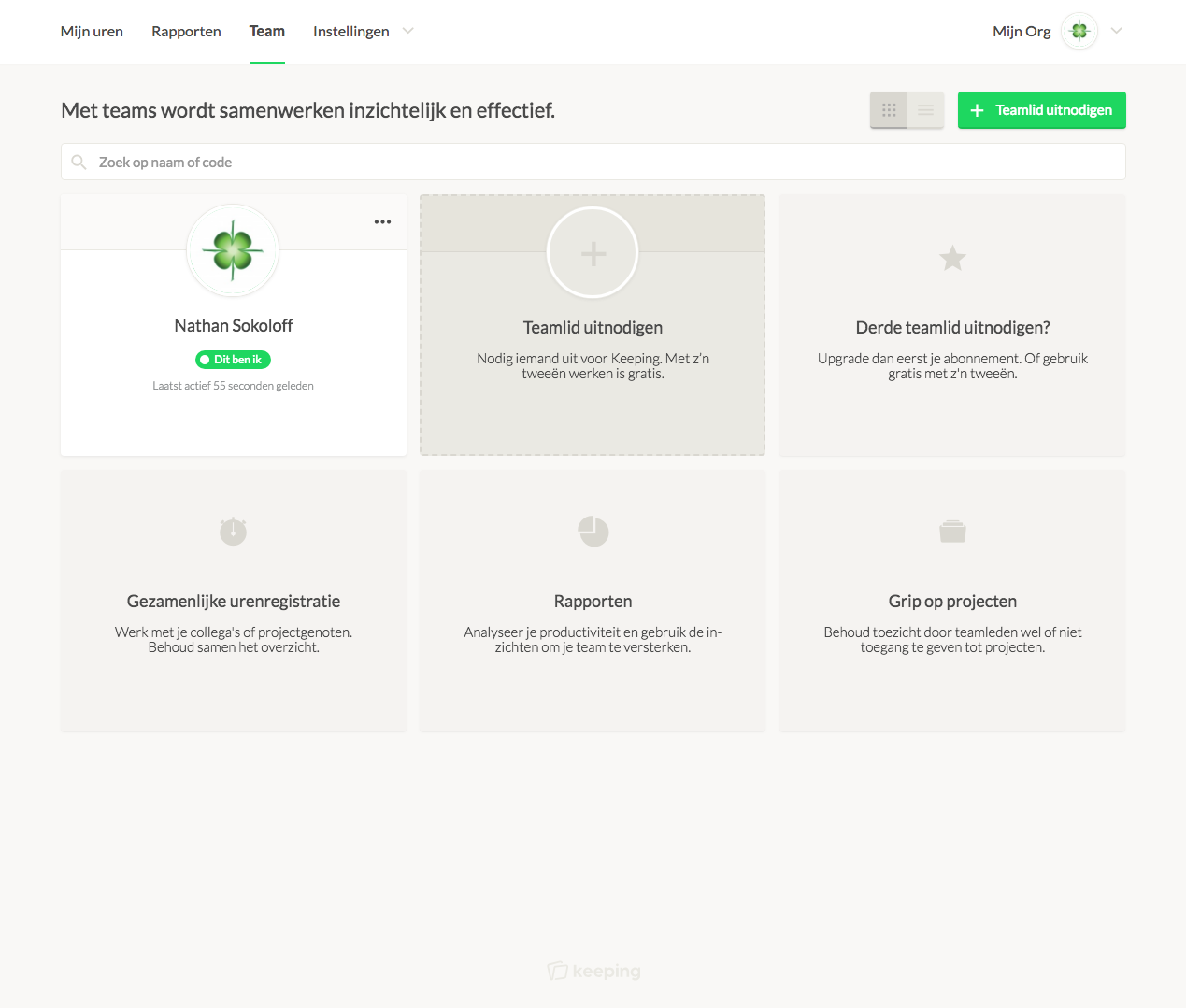
Image: The updated TEAM overview with zero-state.
Once I had mastered the necessary parts of Laravel, the project was successfully completed and merged with the live version of Keeping. Keeping users can now see at a glance what can be done with teams. The new elements help users understand teams and invite them to add members to their Keeping environment.
Biggest Challenge
The most challenging aspect of this project was implementing it through Laravel. Laravel uses a model-view-controller (MVC) model, a pragmatic development approach where most parts of an application are separated. This makes it easy to implement global changes and is a future-proof development approach. I’m glad I was able to learn and apply some of this.
What did you enjoy most about this project?
Styling the zero-state was a lot of fun, and writing copy for the elements was also right up my alley. Initially, my designs were a bit radical, so it was interesting to see how I was guided towards a design that better matched the Keeping brand identity.
Multimedia | Instructional Videos
After improving the teams page, there was also room for improvement in the onboarding process. Onboarding is the process that new users go through before they start using the application. The onboarding covers settings and preferences within Keeping.
"Using a 'sample organisation' made it easier to explain features to users."
One of the desired improvements was adding instructional videos for each step of the process. This helps new Keeping users set up their Keeping environment. This was a whole new area for me, but it is certainly part of Communication & Multimedia Design. I took on the challenge and began researching. The purpose of the instructional videos is to familiarize new users with Keeping so that when they start logging work hours, it’s clear how the application should be used.
A plan of action took shape. I listed all the items covered in the onboarding process for clarity and began drafting a script.
PHASE 1
- Overview of all elements to be explained
- Write an appropriate script
- Present storyboard
PHASE 2
- Digitally record interactions
- Record audio
- Combine & edit visuals/audio
PHASE 3
- Propose graphic layout
- Implementation & styling
- Testing & deployment
Using a ‘sample organisation’ made it easier to explain concepts to users. One of the chosen sample organisations was “Ella’s Event Agency”—a service-oriented organisation that was versatile and easy to follow.
To start, I created storyboards to match the necessary videos. This was a good way to visualize the story and share the script concept. I began recording screencasts, the digital recordings of the screen. Before recording all the videos, I wanted to have one video with audio recorded. This allowed me to show the style I had in mind for the videos.
Once my series of screencasts was in place and the scripts had gone through many revisions, we recorded the actual audio. Of course, it needed a nice background track to avoid feeling too monotonous. Once everything was combined, I began the online implementation.
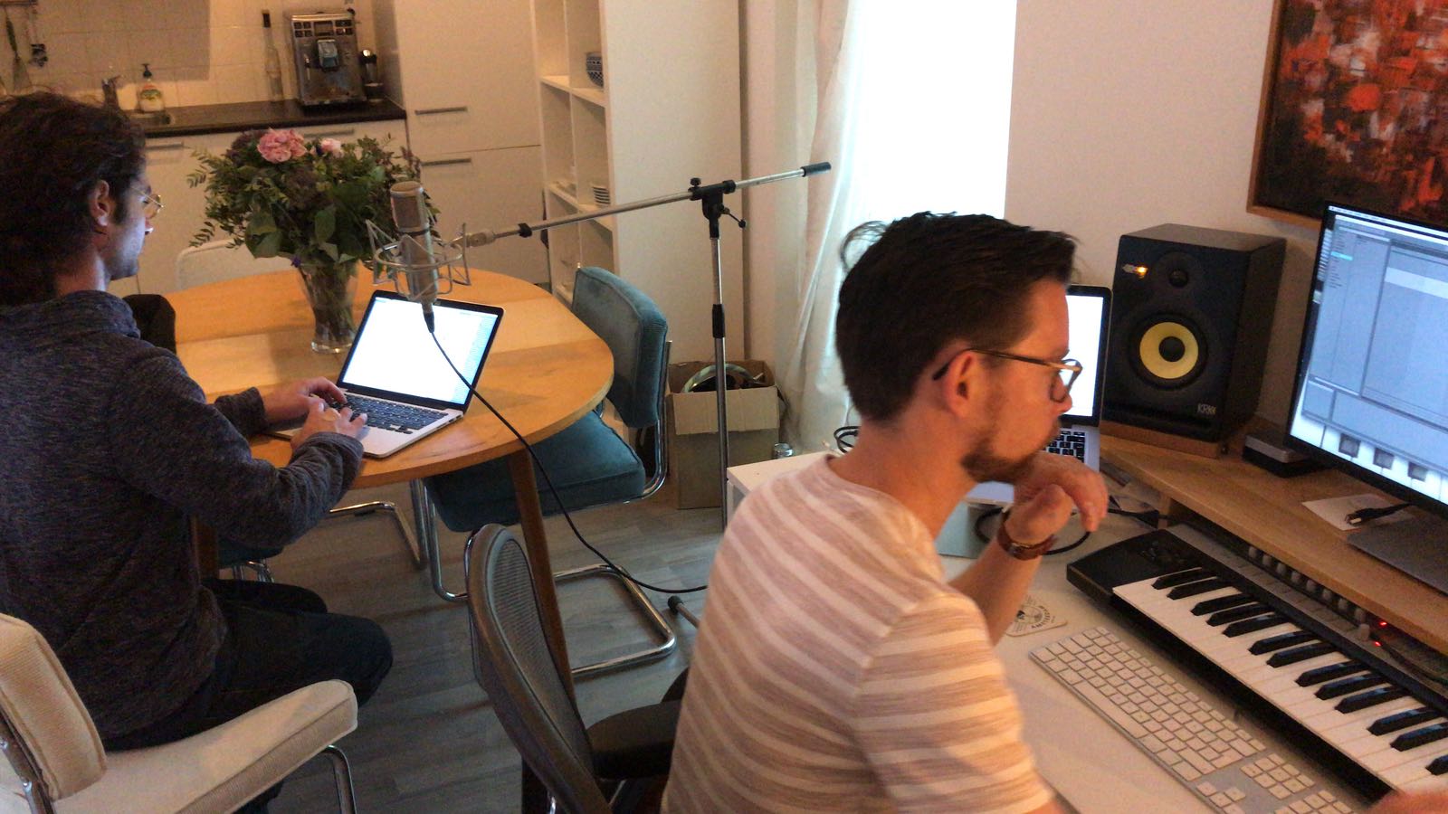
Image: time to record the audio!
Back to Sketch! I needed a clever way to add the videos to the onboarding process without interfering with other elements or distracting visitors too much. I decided to create a few playful and less playful visuals. We ultimately chose a rectangular element with a thumbnail in Keeping-green! It was a solution suitable for larger screens and mobile devices, using a ‘slide-in & slide-out’ technique with the option to close the element.
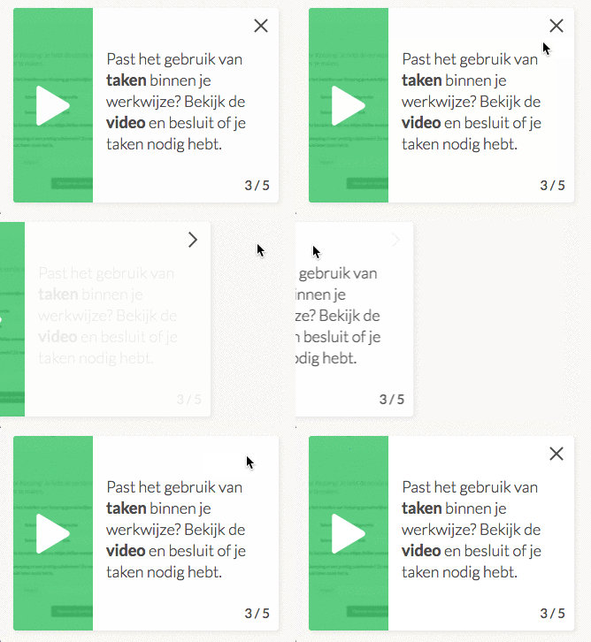
The notification element in action.
The first part of the implementation went quite smoothly. Styling and positioning elements for desktop and mobile wasn’t entirely new to me. The difficult part, however, was the sequence of steps. This was supposed to change but was very complex. Fortunately, Olav (co-founder) was knowledgeable about this, and together, we found a straightforward way to implement it.
Video: New users can now be guided from the first step!Biggest Challenge
The most challenging part was the Adobe Premiere Pro application, the video editing software that made everything possible. Once I mastered the tools